Craigslist Re-Design
Objective: To make Craigslist more appealing to modern e-commerce site users.
I first decided the target audience to keep in mind when taking part in this re-design process. The target audience chosen is anyone who is pursuing collegiate education - students who don’t regularly use Craigslist. Heuristics evaluations were done on the current Craigslist site to pinpoint usability problems I can keep in mind when creating the mockups. Sketching out the main three screens did help me decide what the best features are in order to add them to the final product. Several mood boards were drawn up, each different in their own way and focusing on a particular trend observed in the secondary trends review. All this is done to make sure the mockups are as user friendly as possible, and visually appealing as well.
Current Craigslist Pages
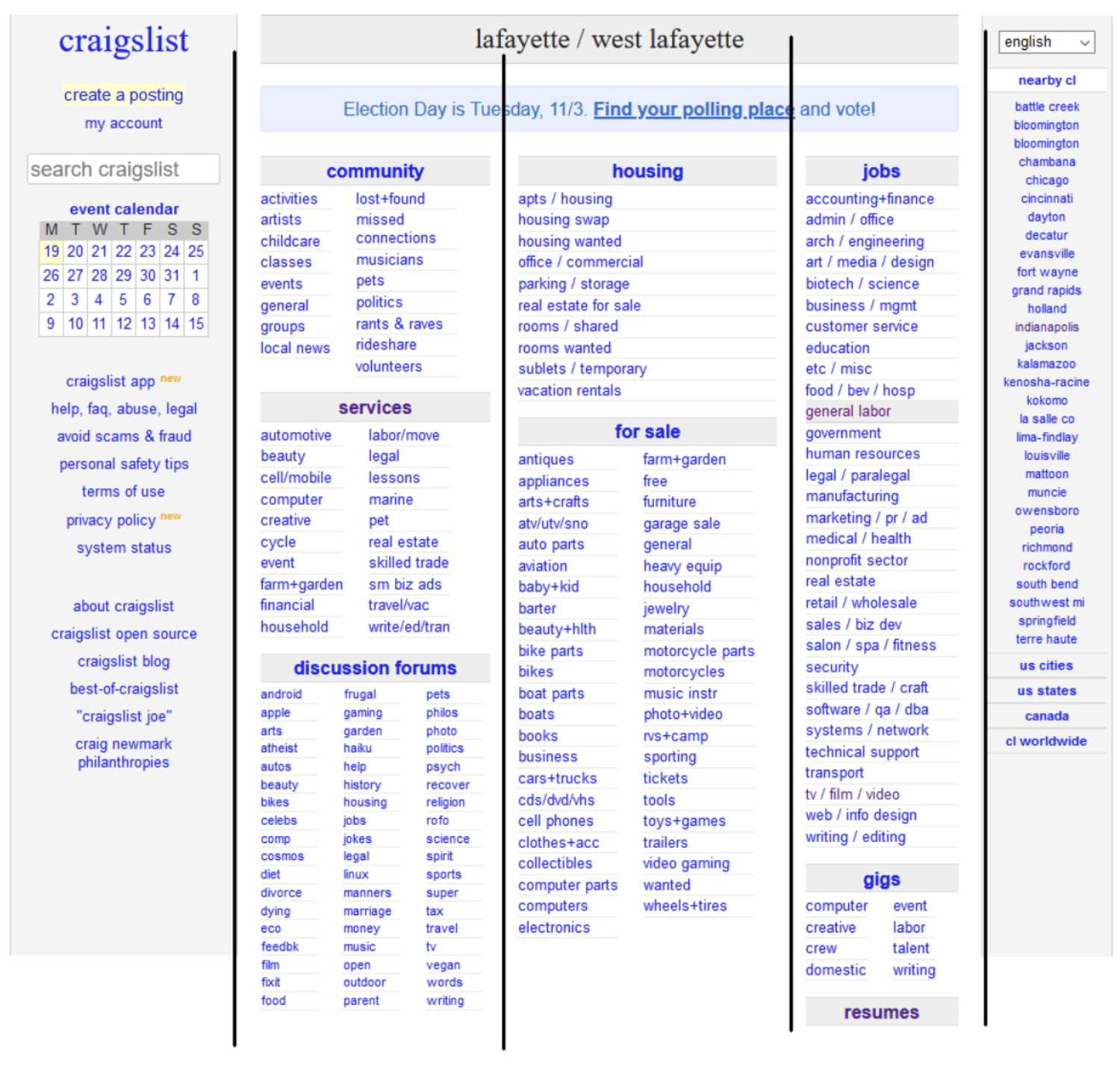
Home Page
Users will be able to view all the different categories of products and utilize the calendar + make a posting features.
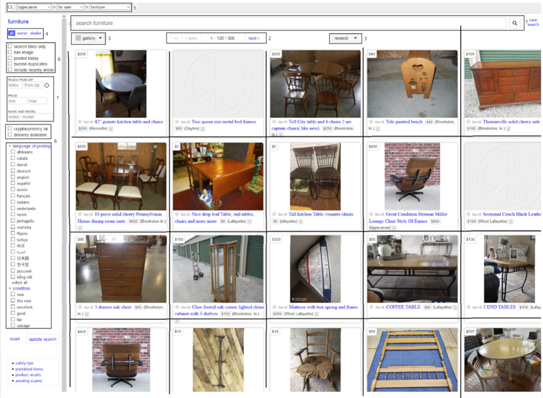
Listing Page
Users will be able to browse items that are being sold here.
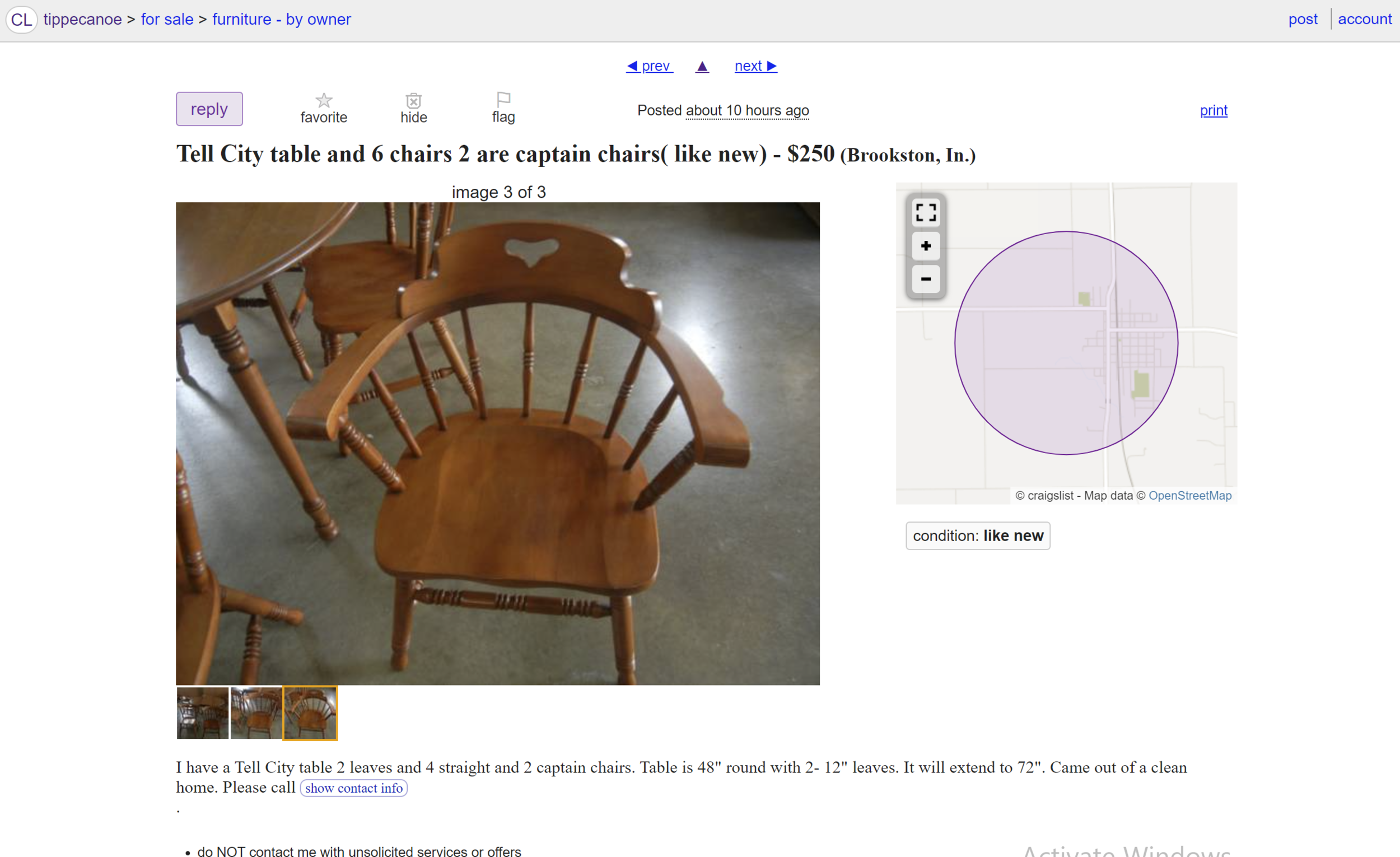
Single Item Page
Users will receive more information about the product here based on how much information the seller wants
Heuristic Evaluation
What for?
An evaluation of the heuristics involved with Craigslist current website is to help see what to to do/ not to do in the redesign. Craigslist has not had a major update in any aspect since it’s release. As it currently sits, it is very out of touch and a bit bland because it has no visual aesthetic/ is over simplified. I have determined a set of tasks related to navigating Craigslist and will rate the experience with these tasks in relation to the design heuristics. Click on the button below to view the detailed evaluation.
E-commerce Web Trends Review
Why?
The trends review helps us understand the needs of existing customers and the market. By examining other businesses that also take part in the e-commerce industry, I will be able to pinpoint features that are new and successful with the users, and then try to find the reasoning as to why it is they are so successful.
Click on the button below to view the my trends review!
Competitive Review
The purpose of conducting Competitive reviews is to allow design teams to assess a competitor’s products from the user’s point of view. The goal is to evaluate how competitor's systems accomplish similar goals by conducting secondary research about the site’s user interface elements and usability features.
Click the button to view the competitive review!
Interface Inventory
The purpose of an interface inventory is to assess the user interface elements of Craigslist and the basic grid that the information that the website is displaying is aligned to. The importance of this is to show the priorities of what Craigslist’s designers intended to show off.
Click the button to view the interface inventory!
Mood Boards
Creating mood boards allows me to begin establishing a style guide and visualize different potential design aspects I may want to include in the final design.
Click the button to view the mood boards!
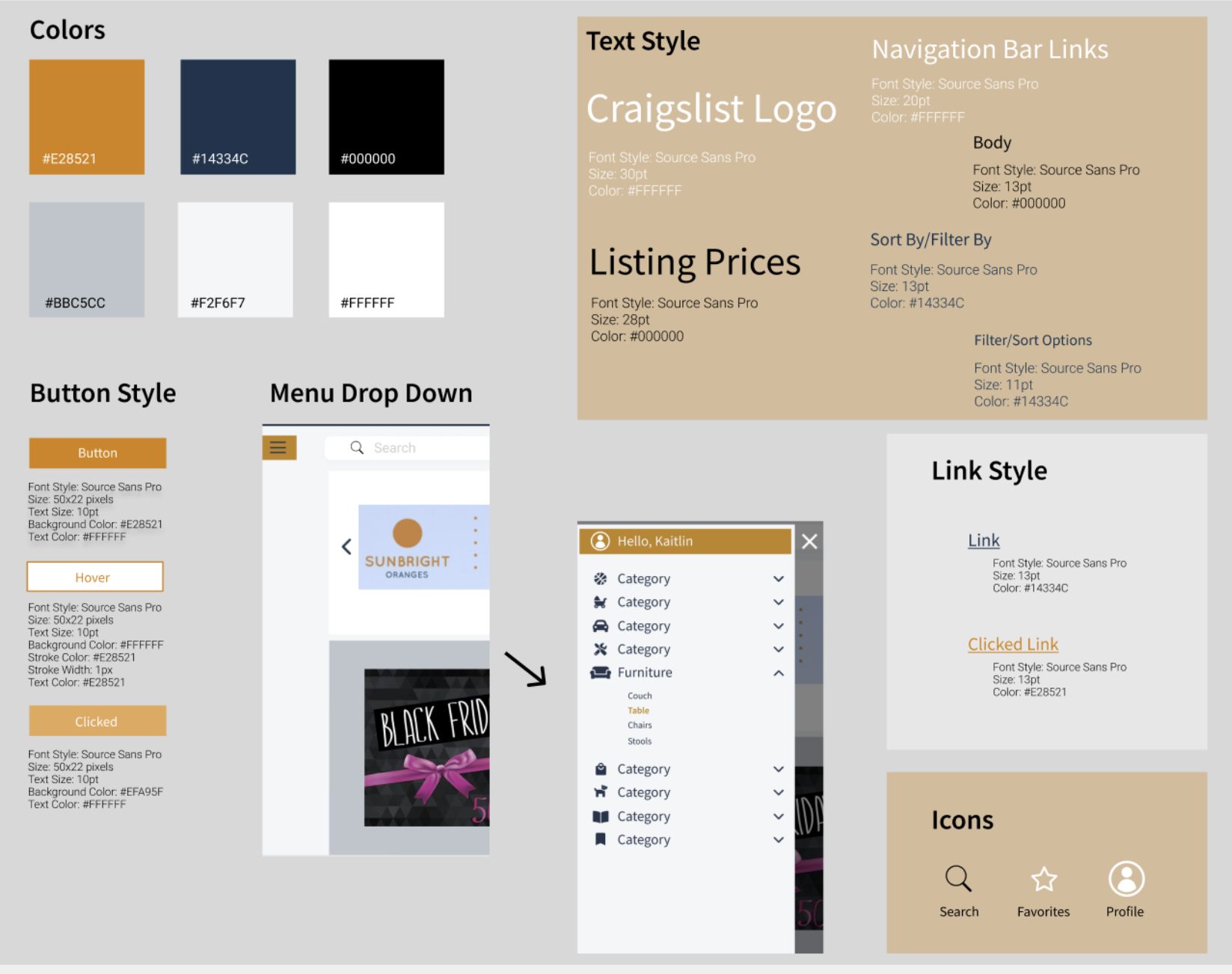
Style Guide
A style guide is used as a guide when making design decisions. Here is where colors, fonts, and other styles are assigned. It allows for everyone on a team to be on the same page when they are in the process of designing. This keeps the look of each page cohesive and represents how the company the site is showcasing should be represented.
Make it stand out.
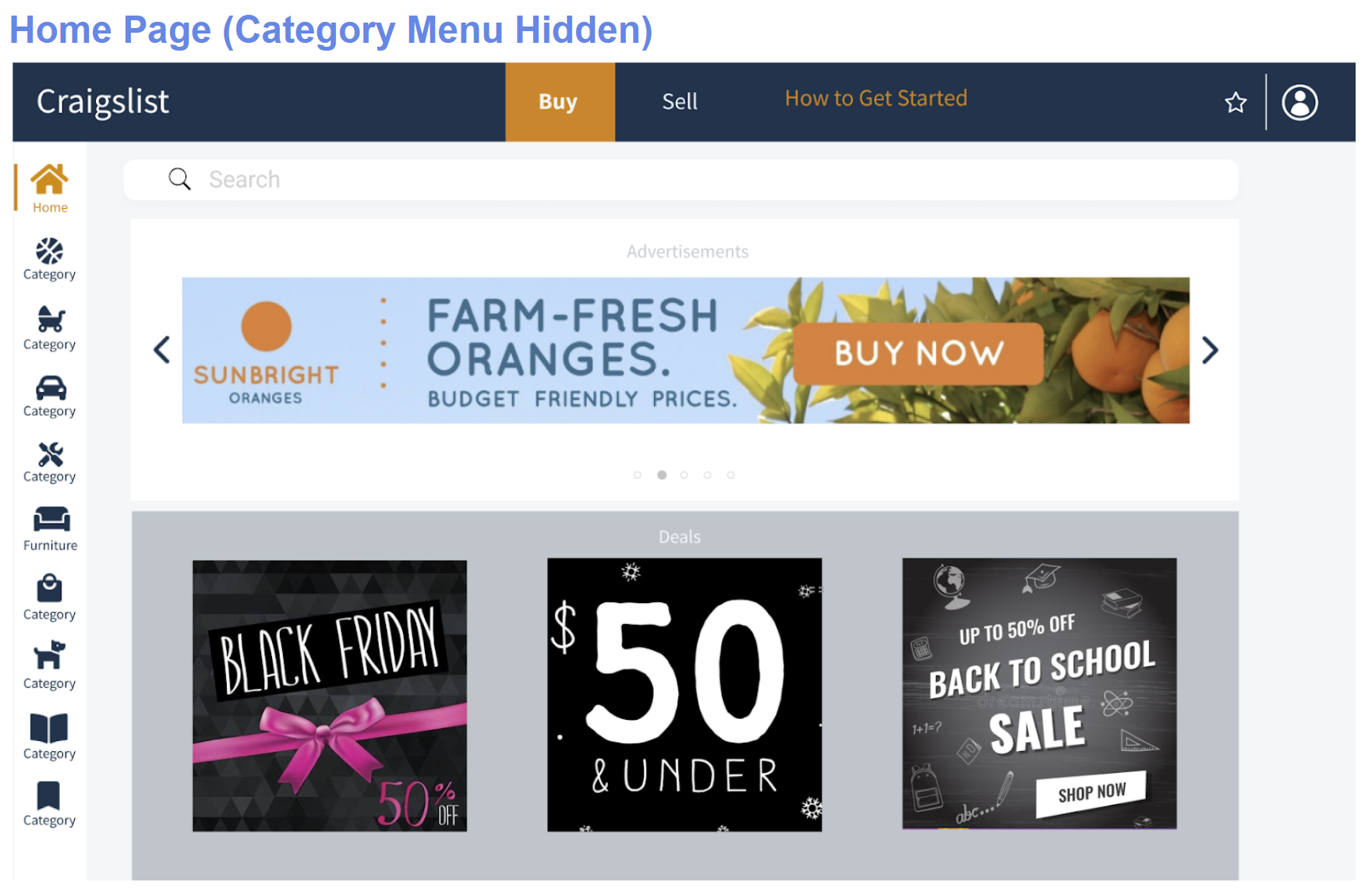
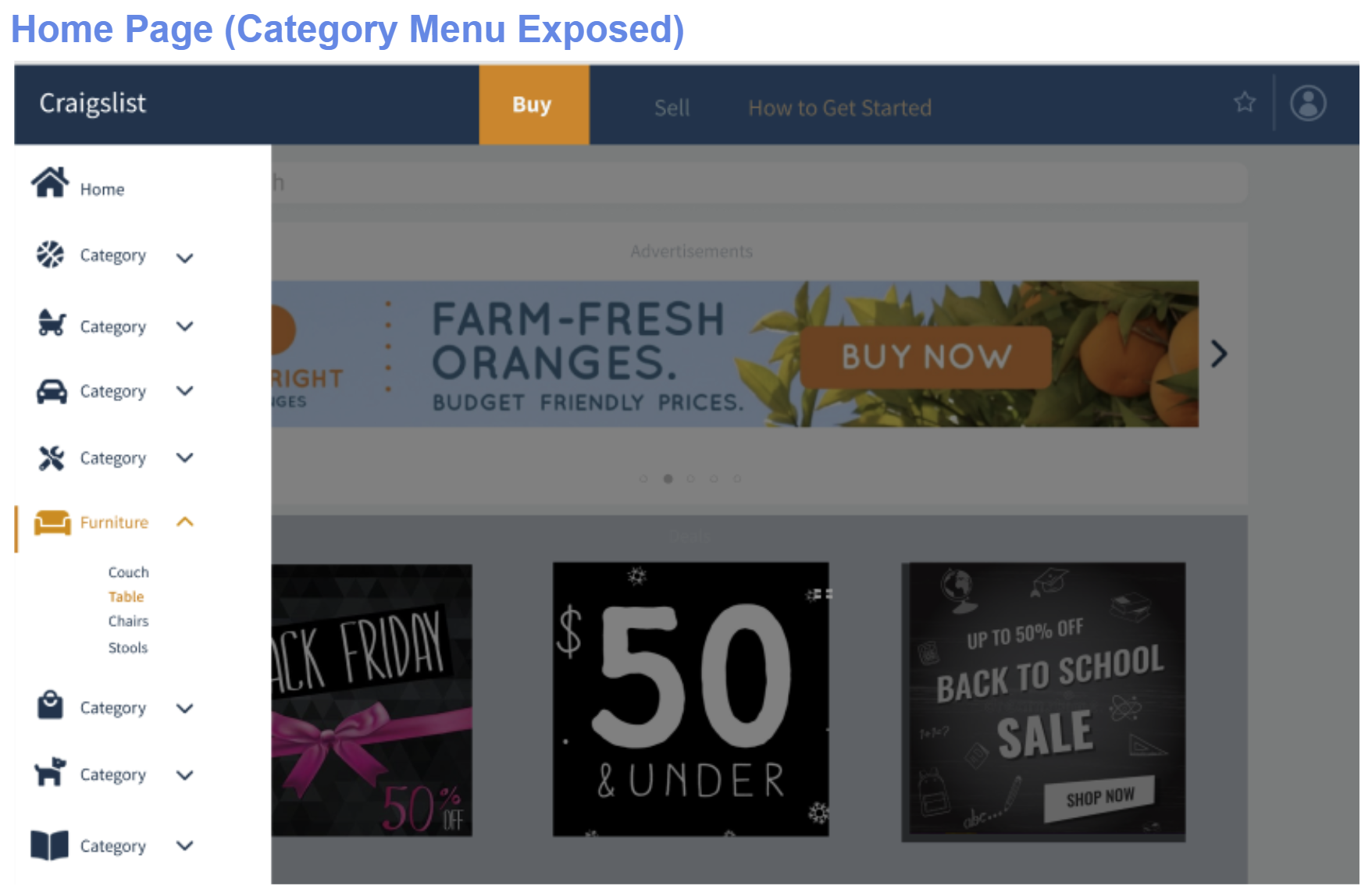
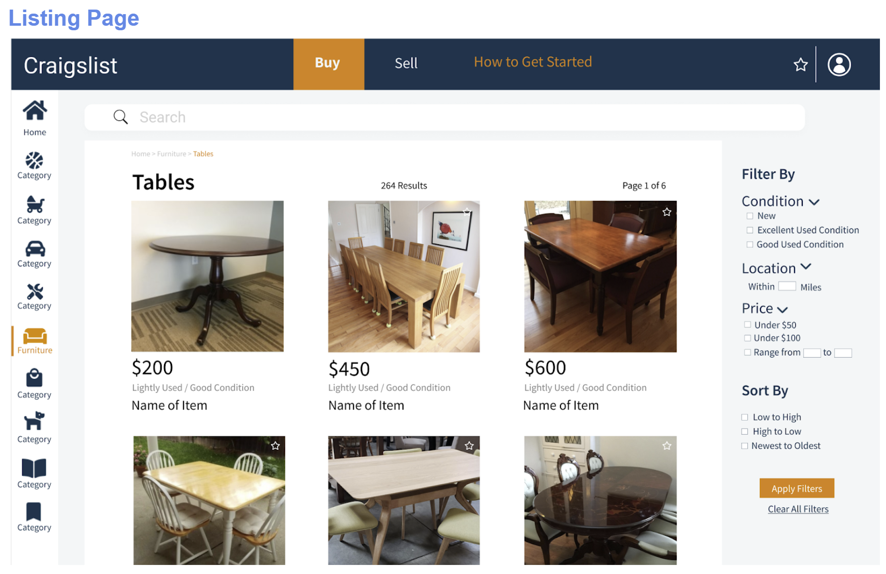
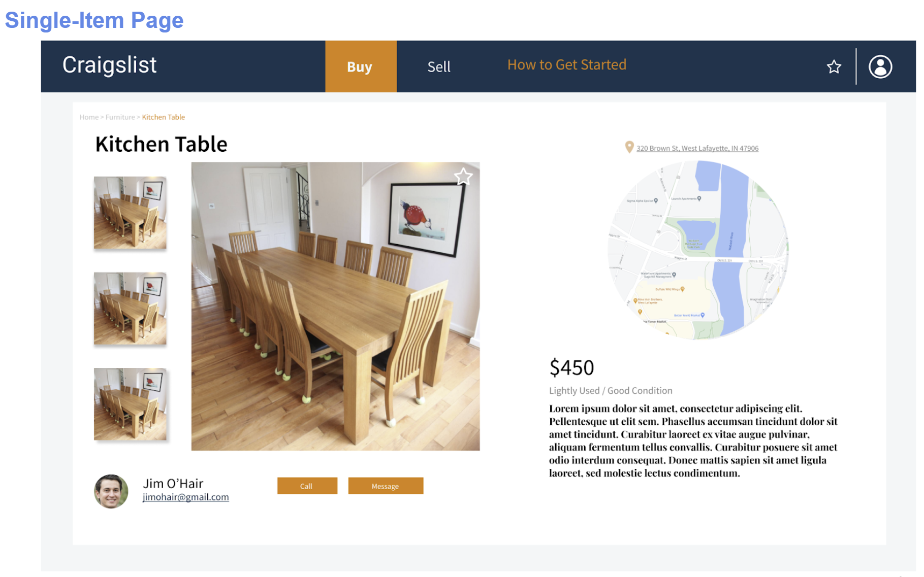
The purpose of the Mock-Ups allow us to test the design choices and see how they would look with the style guide. I was able to combine all of the design ideas to create screens that look as realistic as they can. Through our three screens I wanted the user to be able to see how the process would like if they were to purchase an item. These Mock-Ups will be used in the Desirability Testing Process to see how the target audience responds to the design solution compared to the existing Craigslist site.
Desirability Testing
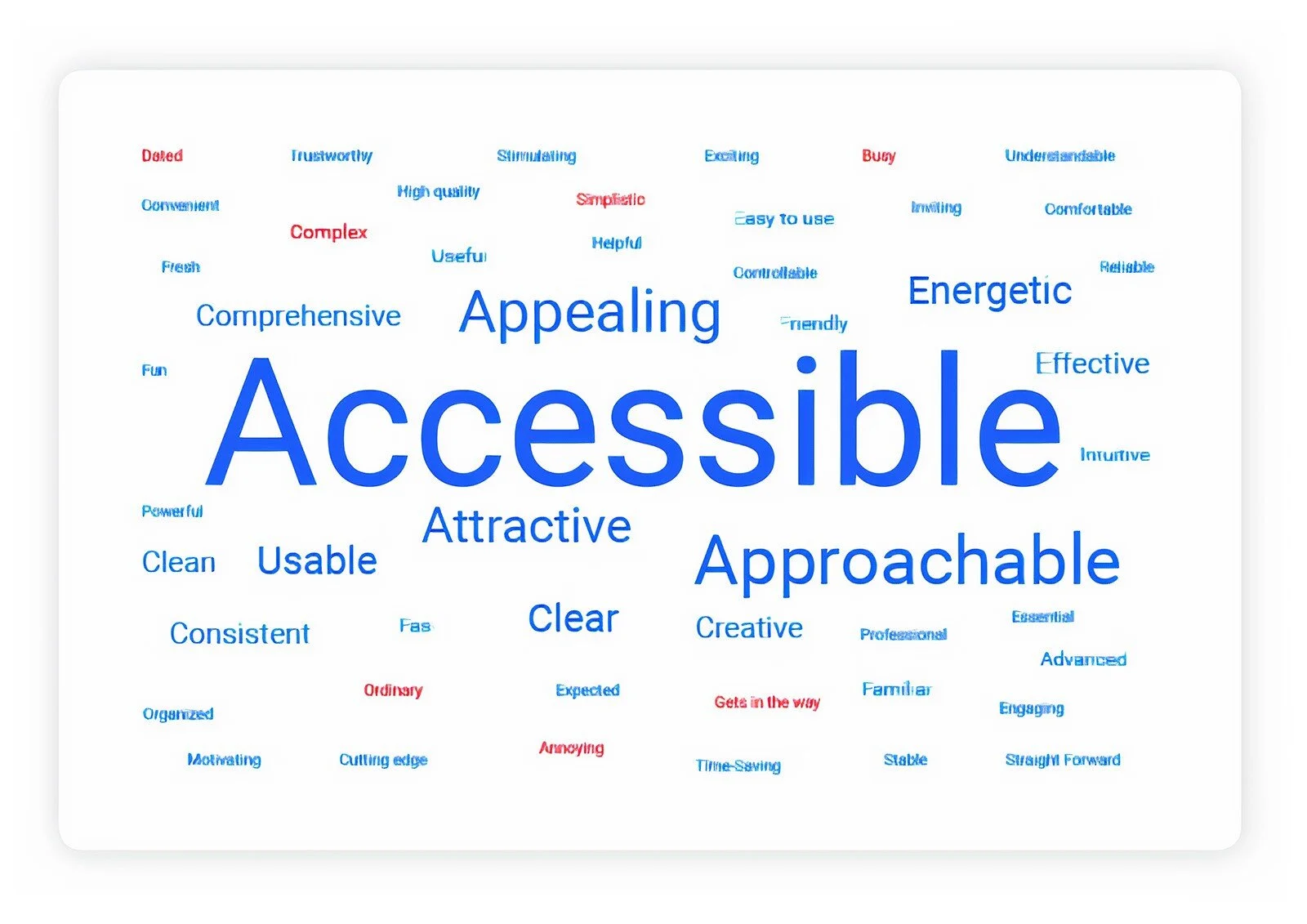
The point of desirability testing is to find out how users feel about a new design in comparison to a previous design. Twelve college students who rarely used Craigslist were interviewed and were asked to choose between two words as to which one better describes the page’s design. Beyond this, they were asked about their general thoughts about the site as well.
Click the button to view the results!
Next Steps
The next step would be to utilize the mockups and actually turn it into a working website. From there, I would like to add tutorial videos on how to use Craigslist in the ‘How To Get Started’ page so that users would be able to use this resource to feel more comfortable when cruising through the site, which is especially helpful for first time users. I would also like to create a mobile version of this application in the future as well. Based on the feedback from the desirability testing, I would make modifications to my webpages. One of the feedbacks we received mentioned removing the ads because they don’t seem to fit the theme of Craigslist. I agree with that for the most part so that would definitely be something too look at in order to make a successful change.
Conclusion
The task at hand was to redesign Craigslist to appeal to modern e-commerce site users after deciding that college students would be the target audience. Heuristics evaluations were done on the current Craigslist site to pinpoint usability problems I can keep in mind when creating the mockups. Several mood boards were drawn up, each different in their own way and focusing on a particular trend observed in the secondary trends review. All this is done to make sure the mockups are as user friendly as possible, and visually appealing as well. Four screens were included in the final mockup : Home Screen, Listing Page (menu closed), Listing Page (menu hovered over), and the Single Item Page. To see how the target audience would react to the redesign, I took part in desirability testing.
The desirability testing showed that a majority of users thought that Craigslist’s current design looks dated, boring, and intimidating. They mentioned the numerous links presented on the home page made it stressful. The reaction to my redesigned pages gave the impression that it is familiar to other sites the users have interacted with and that having the seller listed with their information made them, as buyers, feel a little more comfortable purchasing on Craigslist.

